COMPETITIVE ANALYSIS
Vogue Runway
Zara
New York Times
CNN


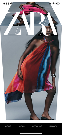


For the first product launch, we optimized the mobile design to closely reflect and align the desktop experience. Future innovations would include experimenting with styled examples such as these with vertical imagery. These examples also feature interactive gestures such as swiping in all directions with strategic intention and visual intrigue. The "Vogue" concept uses bookmarking and sharing to engage users with curated profiles. The "Zara" concept incorporates a 3D-block effect when swiping up or down to rotate images. The "New York Times" concept features audio in the gallery with subtitles. The "CNN" concept showcases a clean and clear relationship between the images and descriptions.
USER JOURNEY
GALLERY
We designed an in-article image gallery to give users a visually enriched experience with captioned descriptions for select editorials. The gallery included automatically rotating thumbnails for users to choose and skip images in sequence. The design also enabled clicking on the images to expand in full view and zoom in for an even closer look.


The arrows are immediately visible on the main image. Arrows animate left or right on hover with a cross-fade transition between images. The image description in black strip appears on hover over the image.
